Analysis

# Load packages
library(tidyverse)
── Attaching core tidyverse packages ──────────────────────── tidyverse 2.0.0 ──
✔ dplyr     1.1.4     ✔ readr     2.1.5
✔ forcats   1.0.0     ✔ stringr   1.5.1
✔ ggplot2   3.5.2     ✔ tibble    3.3.0
✔ lubridate 1.9.4     ✔ tidyr     1.3.1
✔ purrr     1.1.0     
── Conflicts ────────────────────────────────────────── tidyverse_conflicts() ──
✖ dplyr::filter() masks stats::filter()
✖ dplyr::lag()    masks stats::lag()
ℹ Use the conflicted package (<http://conflicted.r-lib.org/>) to force all conflicts to become errors
library(ggplot2)
library(rnaturalearth)
Warning: package 'rnaturalearth' was built under R version 4.5.2
library(rnaturalearthdata)
Warning: package 'rnaturalearthdata' was built under R version 4.5.2

Attaching package: 'rnaturalearthdata'

The following object is masked from 'package:rnaturalearth':

    countries110
library(plotly)
Warning: package 'plotly' was built under R version 4.5.2

Attaching package: 'plotly'

The following object is masked from 'package:ggplot2':

    last_plot

The following object is masked from 'package:stats':

    filter

The following object is masked from 'package:graphics':

    layout
library(htmlwidgets)
Warning: package 'htmlwidgets' was built under R version 4.5.2
library(sf)
Warning: package 'sf' was built under R version 4.5.2
Linking to GEOS 3.13.1, GDAL 3.11.4, PROJ 9.7.0; sf_use_s2() is TRUE
# Load cleaned data
load("df_clean.RData")

Question 1: How has the average global infant mortality rate changed over the decades? What is the prevailing trend of infant mortality rate among groups of countries over the last three decades?

p1 <- df_clean |> 
  filter(entity == "World") |>
  ggplot(aes(x = year, y = rate)) +
  geom_line(color = "steelblue") +
  labs(title = "Global Infant Mortality Rate (1990-2023)",
       x = "Year",
       y = "Infant deaths per thousand live births",
       caption = "Source: Our World in Data | Author: Son Pham") +
  theme_minimal() +
  theme(plot.title = element_text(face = "bold", 
                              size = 12, 
                              hjust = 0.5),
        axis.title.x = element_text(face = "bold",
                                    size = 10,
                                    margin = margin(t = 10)),
        axis.title.y = element_text(face = "bold",
                                    size = 10,
                                    margin = margin(r = 10)),
        plot.caption = element_text(margin = margin(t = 10)),
        legend.title = element_text(face = "bold",),)

ggplotly(p1)
# Saving plot as png
ggsave("out/chart1.png", plot = p1, width = 8, height = 6, dpi = 300)

Question 2: Which countries and continents have the highest infant mortality rate in the most recent year?

# Create list of continents
  continent_list <- c("Europe", "Asia", "North America", "South America", "Oceania", "Africa")
# Create line chart for country classifications (low-income, high-income, etc.)
p2 <- df_clean |>
  filter(entity %in%c("Lower-middle-income countries", "High-income countries", "Upper-middle-income countries")) |>
  ggplot(aes(x = year, y = rate, color = entity)) +
  geom_line(linewidth = 0.7) +
  scale_color_brewer(palette = "Set2") +
  labs(title = "Infant Mortality Rate in Country Groups",
       x = "Year",
       y = "Infant deaths per 100 live births",
       caption = "Source: Our World in Data | Author: Son Pham",
       color = "Group") +
  theme_classic() +
  theme(plot.title = element_text(face = "bold", 
                              size = 12, 
                              hjust = 0.5),
        axis.title.x = element_text(face = "bold",
                                    size = 10,
                                    margin = margin(t = 10)),
        axis.title.y = element_text(face = "bold",
                                    size = 10,
                                    margin = margin(r = 10)),
        plot.caption = element_text(margin = margin(t = 10)),
        legend.title = element_text(face = "bold",),)

ggplotly(p2)
# Saving plot as png
ggsave("out/chart2.png", plot = p2, width = 8, height = 6, dpi = 300)
# Create line chart for 
p3 <- df_clean |>
  filter(entity %in% continent_list) |>
  ggplot(aes(x = year, y = rate, color = entity)) +
  geom_line(size = 0.7) +
  scale_color_brewer(palette = "Set2") +
  labs(title = "Infant Mortality Rate in Continents",
       x = "Year",
       y = "Infant deaths per 100 live births",
       caption = "Source: Our World in Data | Author: Son Pham",
       color = "Continent") +
  theme_classic() +
  theme(plot.title = element_text(face = "bold", 
                              size = 12, 
                              hjust = 0.5),
        axis.title.x = element_text(face = "bold",
                                    size = 10,
                                    margin = margin(t = 10)),
        axis.title.y = element_text(face = "bold",
                                    size = 10,
                                    margin = margin(r = 10)),
        plot.caption = element_text(margin = margin(t = 10)),
        legend.title = element_text(face = "bold",),)
Warning: Using `size` aesthetic for lines was deprecated in ggplot2 3.4.0.
ℹ Please use `linewidth` instead.
ggplotly(p3)
# Saving plot as png
ggsave("out/chart3.png", plot = p3, width = 8, height = 6, dpi = 300)

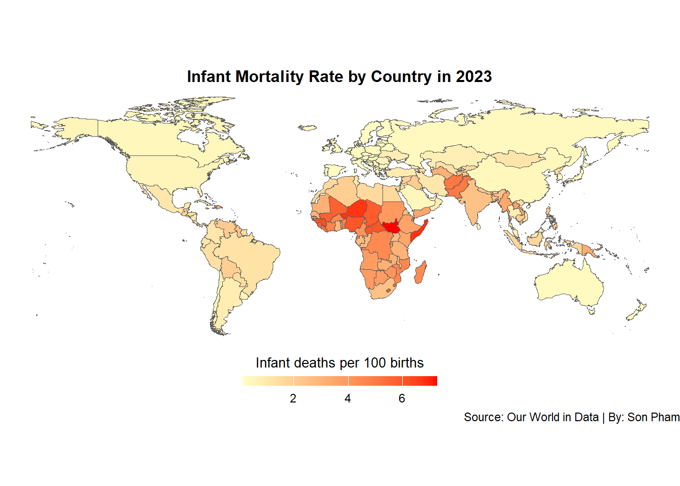
Question 3: What is the infant mortality rate for all countries in the most recent year, and which countries have the highest rates?

df_clean|>
  # Filter dataset to only contain countries
  filter(year == 2023 & !is.na(code) & (nchar(code) < 4)) |>
  select(entity, rate, continent) |>
  # Drop geometry column
  sf::st_drop_geometry(data_all) |>
  group_by(entity) |>
  arrange(desc(rate)) |>
  head(df_merge, n=10)
# A tibble: 10 × 3
# Groups:   entity [10]
   entity                    rate continent
   <chr>                    <dbl> <chr>    
 1 South Sudan               7.26 Africa   
 2 Somalia                   6.78 Africa   
 3 Niger                     6.74 Africa   
 4 Guinea                    6.15 Africa   
 5 Central African Republic  6.04 Africa   
 6 Nigeria                   6.01 Africa   
 7 Chad                      5.87 Africa   
 8 Mali                      5.76 Africa   
 9 Sierra Leone              5.62 Africa   
10 Lesotho                   5.54 Africa   

We can see that the top 10 countries with the highest infant mortality rates are from Africa.

# Map of infant mortality rate by country in 2023
p4 <- df_clean |>
  filter(year == 2023 & !is.na(code) & (nchar(code) < 4)) |>
  ggplot(aes()) +
  geom_sf(aes(geometry = geometry, fill = rate)) +
  scale_fill_gradient(low = "#ffffc5", 
                      high = "#ff0000",
                      na.value = "grey90", 
                      name = "Infant deaths per 100 births", 
                      guide = guide_colorbar(
                        barwidth = 10,
                        barheight = 0.5,
                        title.position = "top",
                        title.hjust = 0.5
                      )) +
  labs(title = "Infant Mortality Rate by Country in 2023",
       fill = "Life Expectancy at Birth",
       caption = "Source: Our World in Data | By: Son Pham") +
  theme_void() +
  theme(plot.title = element_text(face = "bold", 
                              size = 12, 
                              hjust = 0.5),
        legend.position = "bottom",
        legend.title = element_text(size = 10),)

p4

# Saving plot as png
ggsave("out/chart4.png", plot = p4, width = 8, height = 6, dpi = 300)

Question 4: What is the correlation between a country’s infant mortality rate and its GDP?

# Load GDP data
load("gdp_clean.RData")
# Filter datasets
df_mortality <- df_clean |>
  filter(year == 2023 & !is.na(code) & (nchar(code) < 4))

df_gdp <- gdp_clean |>
  filter(year == 2023 & !is.na(code) & (nchar(code) < 4))
# Merge datasets
df_merged <- df_mortality |>
  inner_join(df_gdp, by = "entity")

p5 <- df_merged |>
  ggplot(aes(x = log(gdp_capita), y = rate, color = continent, text = paste0(
    "GDP per capita: ", gdp_capita,
    "<br>Rate: ", rate,
    "<br>Country: ", entity,
    "<br>Continent: ", continent))) +
  geom_point(size = 1.25) +
  geom_smooth(method = "lm", 
              se = FALSE, 
              color = "red") +
  labs(x = "GDP per capita (2023)",
       y = "Infant mortality rate",
       shape = "Continent",
       color = "Continent",
       title = "Infant mortality rate vs. GDP per capita, 2023",
       caption = "Source: Our World in Data | Author: Son Pham") +
  theme_bw() +
  theme(plot.title = element_text(face = "bold", 
                              size = 12, 
                              hjust = 0.5),
        axis.title.x = element_text(face = "bold",
                                    size = 10,
                                    margin = margin(t = 10)),
        axis.title.y = element_text(face = "bold",
                                    size = 10,
                                    margin = margin(r = 10)),
        plot.caption = element_text(margin = margin(t = 10)),
        legend.title = element_text(face = "bold",),)

ggplotly(tooltip="text")
`geom_smooth()` using formula = 'y ~ x'
Warning: Removed 13 rows containing non-finite outside the scale range
(`stat_smooth()`).
# Saving plot as png
ggsave("out/chart5.png", plot = p5, width = 8, height = 6, dpi = 300)
`geom_smooth()` using formula = 'y ~ x'
Warning: Removed 13 rows containing non-finite outside the scale range
(`stat_smooth()`).
Warning: Removed 13 rows containing missing values or values outside the scale range
(`geom_point()`).
# Calculate Pearson correlation
cor(df_merged$rate, log(df_merged$gdp_capita), use = "complete.obs") #Remove NA values from calculation
[1] -0.8068666